Android L
12 Ways Android Is Now as Pretty as the iPhone
Google I/O, the annual conference where Google makes its biggest announcements of the year, is happening right now. One of the biggest reveals so far is the newest version of the operating system that powers Android phones, called, mysteriously, Android L. It's the "biggest release to date," said David Burke, director of engineering at Android, and we have to agree — the design of the new mobile system is gorgeous.
It's defined by bold colors, fun animations, and a "flat" design aesthetic. Looks like Android is finally catching up to iOS in terms of design. Like iOS, Android L has a bright, Lisa Frank-esque color scheme. The interface seems to disappear into the content with its transparent layers.
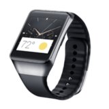
Android is shedding its formerly dark UI (nerd speak for "user interface") for an entirely new design identity. When you're looking at Android L, the graphic elements aren't competing for dominance. The new OS guides you by animating buttons you can touch and interact with. The new font, Roboto, is clean, sharp, and intended to be more legible on smaller devices, like a smartwatch.
It's also supersmart. If you're wearing a smartwatch with Android Wear installed, you won't need to enter in your phone's passcode when the watch is nearby. A new battery-saving feature called "Project Volta" provides usage analysis, which can lead to significant battery life improvement (up to 90 minutes extra). The developer preview of Android L is available tomorrow on developer.android.com. Stay tuned for more info!
Android L >> a new look for Google mobile. Super flat, bold colors, animated buttons. PRETTY. #GoogleIO2014 pic.twitter.com/tPKTGbVi8e
— POPSUGAR Tech (@POPSUGARTech) June 25, 2014
Source: Google Design


